
Custom Scroll Effects In Flutter Using CustomScrollView
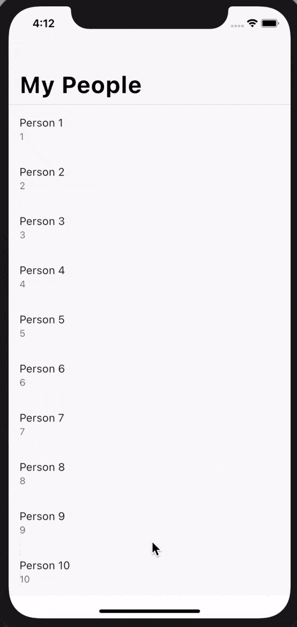
Have you ever wondered how nice scrolling effects like the collapsible navigation bar can be achieved in Flutter? Well, look no further – CustomScrollView is your answer. In this very short post I am going to show you how you can create a collapsible Cupertino navigation bar using the CustomScrollView widget. Here is the end result:
The CustomScrollView Widget
According to the Flutter docs a CustomScrollView is a scroll view that allows you to add Slivers directly to achieve custom scroll effects. A Sliver is a portion of a scrollable area that you can define to behave in a special way. A CustomScrollView has a property slivers which is a list of widgets. Each of the widgets must produce RenderSliver otherwise you will get a runtime error. Now that you know what a CustomScrollView is let’s write some code. The complete source code can be found on GitHub.
Example
Create a new Flutter application and add a stateless widget HomePage add add the following code:
class HomePage extends StatelessWidget {
  final List<Person> people;

  const HomePage({Key key, this.people}) : super(key: key);

  @override
  Widget build(BuildContext context) {
    return CupertinoPageScaffold(
      child:  SafeArea(
        top: false,
        child: CustomScrollView(
            slivers: [
                CupertinoSliverNavigationBar(
                    largeTitle: Text('My People'),
                ),
                SliverList(delegate: SliverChildBuilderDelegate((context, index) {
                    final person = people[index];
                    return Material(
                    child: ListTile(
                        title: Text(person.name),
                        subtitle: Text('${person.age}'),
                    ),
                    );
                },
                childCount: people.length,
                ))
            ],
    )));
  }
}
I am using Cupertino widgets instead of Material widgets for a change  . Our
. Our CustomScrollView contains a CupertinoSliverNavigationBar – an iOS-styled navigation bar with iOS-11-style large titles using slivers and a SliverList. As you scroll up the list the navigation bar will shrink and the title size changes (see Figure 1 above). That’s it! A collapsible navigation bar using CustomScrollView.
Now to put everything together add this to your main.dart
void main() {
  runApp(MyApp());
}

class MyApp extends StatelessWidget {
  final List<Person> people =
      List.generate(100, (index) => Person('Person ${index + 1}', index + 1));

  @override
  Widget build(BuildContext context) {
    return CupertinoApp(
        title: 'Custom Scroll',
        debugShowCheckedModeBanner: false,
        localizationsDelegates: [
          DefaultMaterialLocalizations.delegate,
          DefaultCupertinoLocalizations.delegate,
          DefaultWidgetsLocalizations.delegate,
        ],
        theme: CupertinoThemeData(primaryColor: Colors.teal),
        home: HomePage(
          people: people,
        ));
  }
}
The same effect can be achieved using Material widgets.
Like always, thank you so much for taking your time to read. Stay safe and God bless.
Comments