
Working With Themes In Flutter
When building Flutter applications themes come in handy when you want to share colors, fonts and other styles across your entire application. This will help avoid unnecessary duplication when creating your widgets. In addition, most users nowadays expect your application to support dark mode and in order for you to achieve that you need to know how to create and work with custom themes. In this post I am going to talk briefly about how you can take advantage of custom themes to create an identity for your application as well as support dark mode.
Create Custom Theme
The MaterialApp class has a property theme which is of type ThemeData. ThemeData defines the overall visual theme of your application. This class has a lot of theme properties you can customize ranging from text styles to color schemes. To see all the properties that you can customize check out the documentation.
Flutter also enables you to define a dark theme for your application. All you need to do is to set the darkTheme property which, like the theme property, is of type ThemeData. Once you have the darkTheme property set you can then make use of the theme modes explained below.
Here is how you would define and use custom themes:
class MyApp extends StatelessWidget {
  @override
  Widget build(BuildContext context) {
    return GetMaterialApp(
      title: 'Flutter Theme Demo',
      theme: lightTheme,
      darkTheme: darkTheme,
      themeMode: ThemeMode.system, // ThemeMode.system is the default. added here as an example
      debugShowCheckedModeBanner: false,
      home: ThemePage(),
    );
  }

  // light theme
  ThemeData get lightTheme => ThemeData.light().copyWith(
      primaryColor: Colors.teal[500],
      visualDensity: VisualDensity.adaptivePlatformDensity,
    // there are a lot of properties you can customise
  );

  // dark theme
  ThemeData get darkTheme => ThemeData.dark().copyWith(visualDensity: VisualDensity.adaptivePlatformDensity);
}
If you want to override the app’s theme in one of your widget’s subtrees you have to add the Theme widget at the root of your subtree. Now all the widgets in that subtree will make use of that theme instead of the overall app theme.
Theme(
  data: Theme.of(context).copyWith(accentColor: Colors.pinkAccent),
  child: FloatingActionButton(
    onPressed: null,
    child: Icon(Icons.add),
  ),
);
Theme Modes
The MaterialApp class has a property called themeMode which is an enum. When both theme and darkTheme properties are defined for your MaterialApp, themeMode will determine which theme to use. Here are the enum values and the behavior thereof:
-
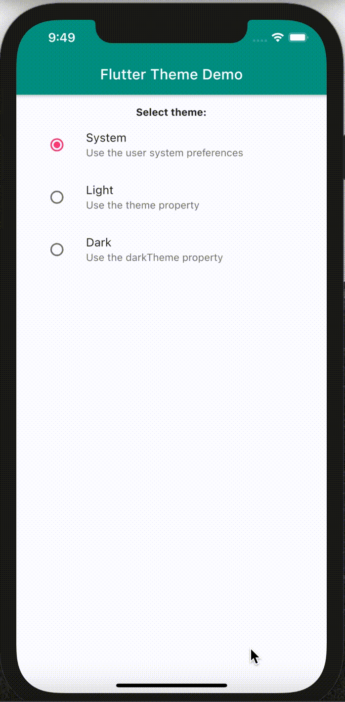
ThemeMode.system: When you select this mode your application will use the user’s system theme preferences. If the user set their phone to use a dark theme then your application will use thedarkThemeotherwisethemewill be used. This mode is also the default mode. -
ThemeMode.light: When you select this mode your application will use thethemeprovided regardless of the user’s system preferences. -
ThemeMode.dark: When you select this mode your application will use thedarkThemeproperty regardless of the user’s system preferences. IfdarkModeis not set the application will fall back to thetheme.
You can dynamically change your application’s theme between the different modes – something that most of your users will expect from your app. Below is an animation that shows an app that switches between modes. The source code is found on GitHub if you want to take a look at it.
Conclusion
In this post I spoke about how you can make use of themes in your application to create an identity for your app. In addition, I spoke about theme modes and their behaviors. Accompanying this post is an simple example app that showcases hot to change an app’s theme dynamically. You may check out the source code on GitHub. Thanks once again for taking your time to read and Happy New Year  !!!
!!!
Comments